K12 Reporting Portal
Role
Sr. Product Designer
With the transition from paper to digital, we transformed a legacy system into a modern data platform for over one million educators serving millions of students annually.
As College Board moved the SAT from paper to digital, K–12 educators needed a clearer, more actionable way to access student performance data. The existing Reporting Portal was fragmented and hard to navigate—making it difficult to spot trends, compare groups, or get the insights they needed.
I led the end-to-end UX and research strategy for the portal’s redesign, restructuring key workflows, rethinking how reports were organized, and building a scalable research practice from the ground up. Partnering closely with engineering, product, and content, I focused on designing around real educator tasks—while navigating legacy systems and tight delivery timelines.
The result: a cleaner, more intuitive platform used by over a million educators—and a shift toward continuous discovery and user-centered product development across teams.
Product Reach
Primary data platform for all digital SAT/PSAT scores in the U.S.
Used in 30,000+ schools; ~90k+ active accounts; shared access extends reach to 800K–1.2M educators.
Supports 7M+ annual assessments.
UX Outcomes
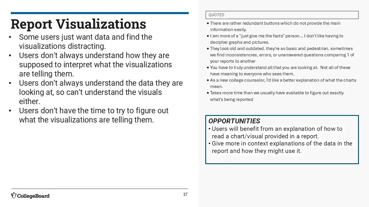
96% said data visualizations were clear
67.5% found new homepage easier to use
83% accessed individual scores smoothly
88% satisfaction with downloads (PDF/raw)
4× increase in research cadence post-launch
UX frameworks now adopted across multiple College Board teams
Note: Many improvements were delivered within strict backend limitations—prioritization and alignment were key to success.

The Shift to Digital Exposed Critical UX Gaps
The 2023–24 digital SAT rollout changed how educators interact with data. Some of the issues of the legacy portal were:
Redundant, unclear reports: Educators struggled to know which report to use for which task.
Limited data slicing: There was no easy way to filter by demographics, grade level, or test format.
Rigid exports: Downloading the data you actually needed was frustrating and inflexible.
Mixed-format confusion: Navigating between paper and digital test results created new layers of complexity.
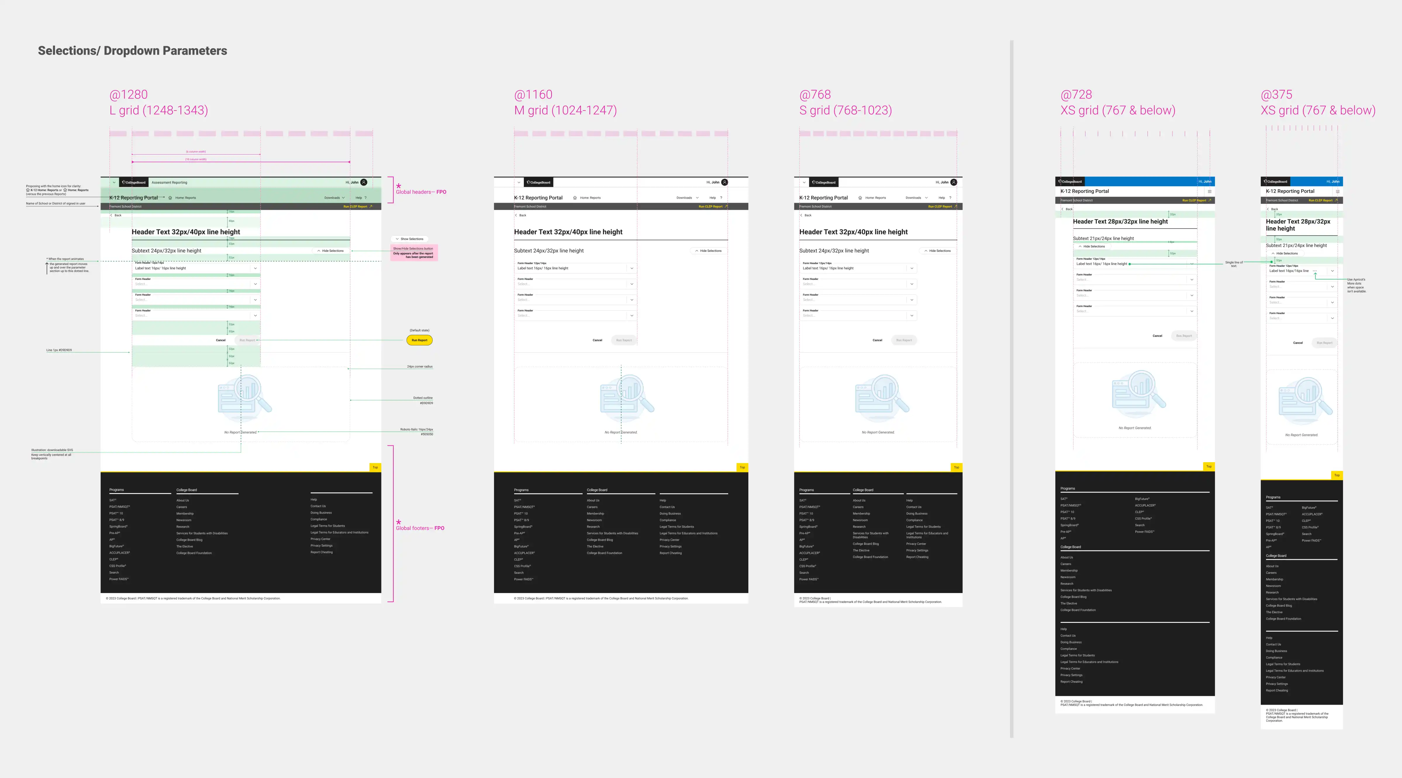
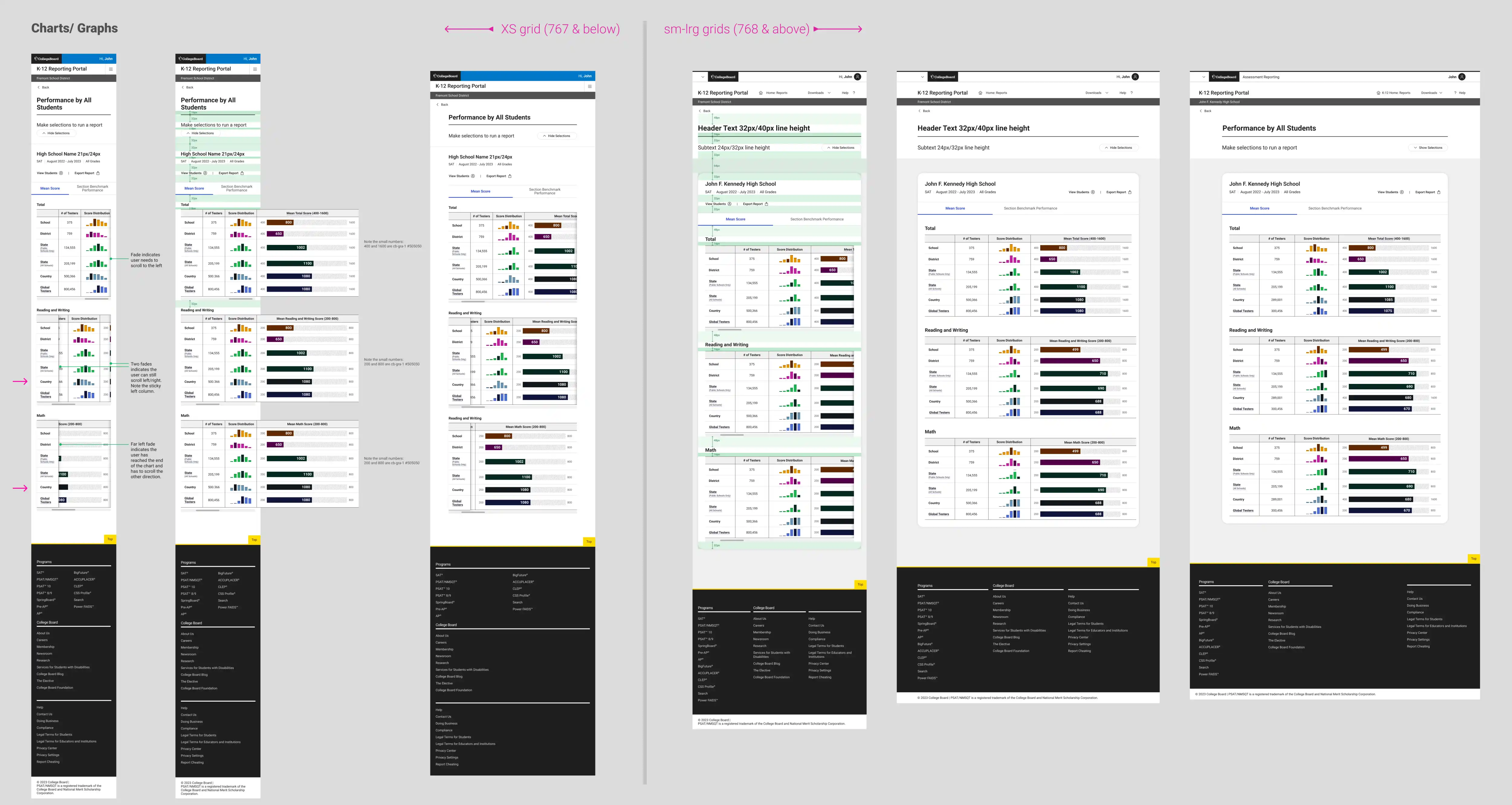
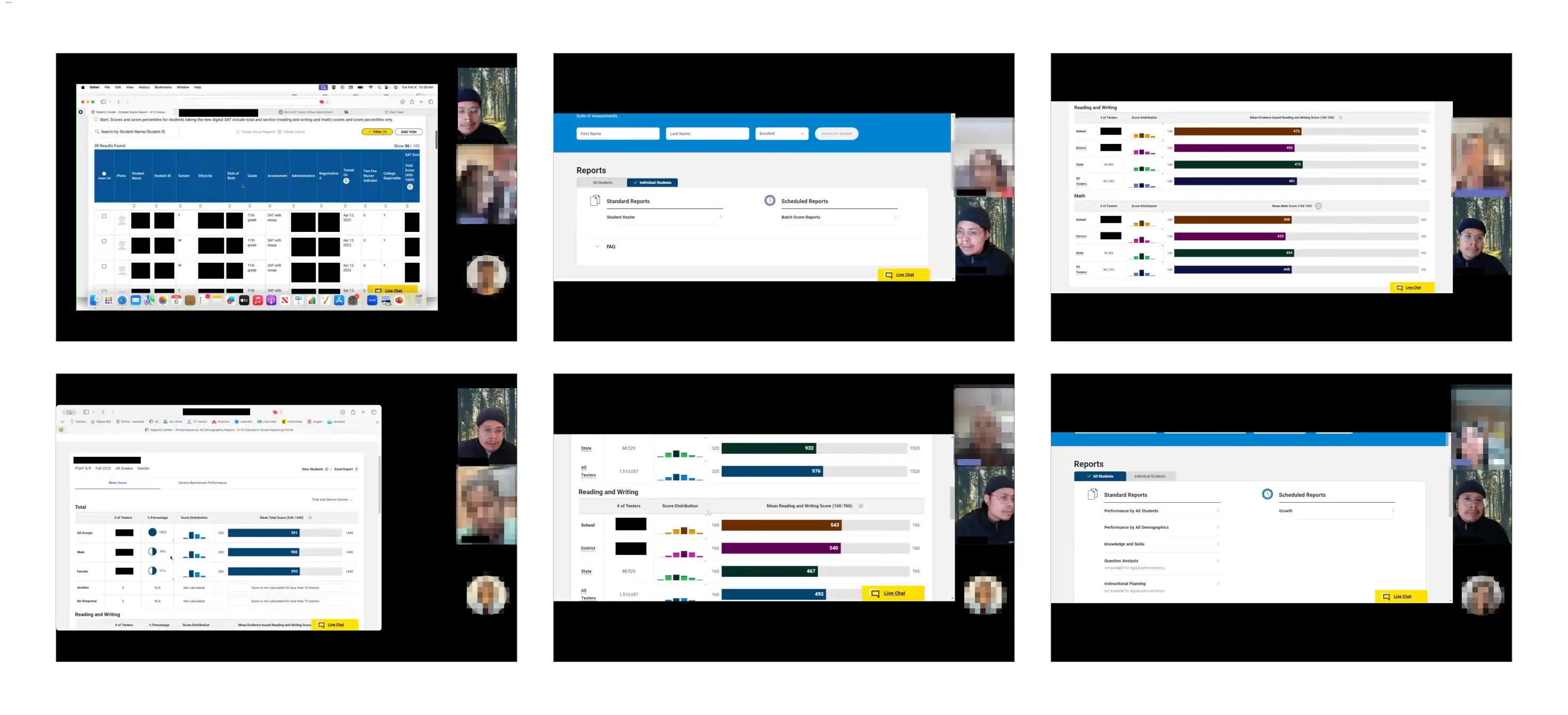
Below are some wireframes from the original portal. At the time, all reports lived inside a single dropdown menu—making it hard for users to find what they needed.

The redesign prioritized clarity, data-centered workflows, and delivering the highest possible value within our technical and timeline constraints.

With the urgency of digital SAT rollout, we had to move fast. As the product design lead, I partnered closely with engineering, content, product, accessibility, and visual design to prioritize changes that could meaningfully improve the experience within time and technical constraints.
🔄 Key Design Strategies
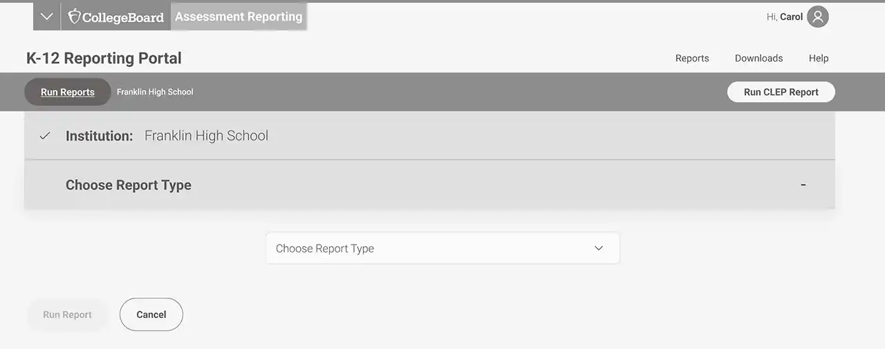
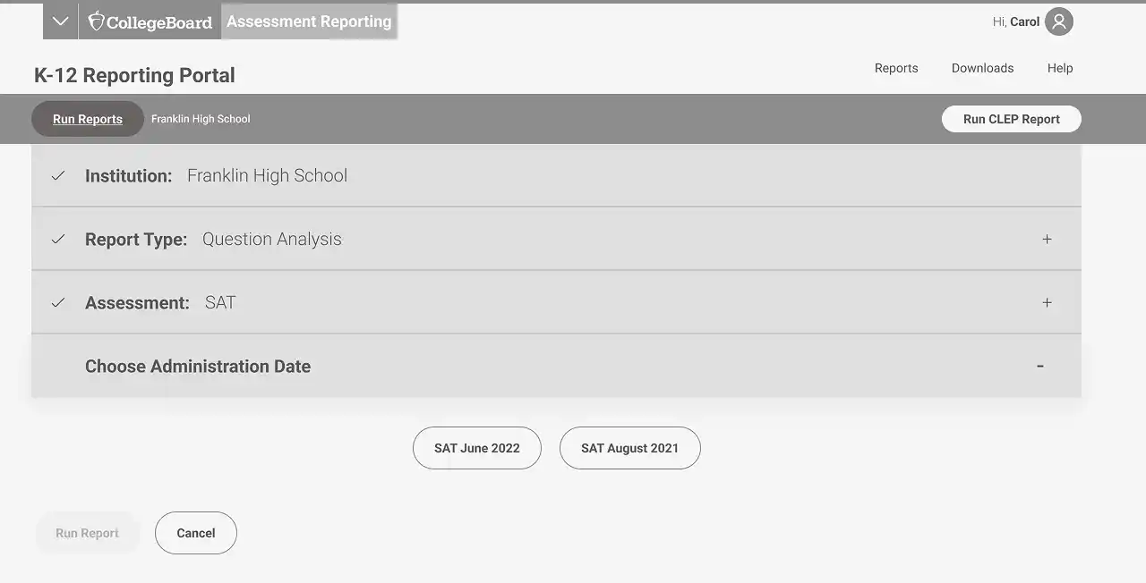
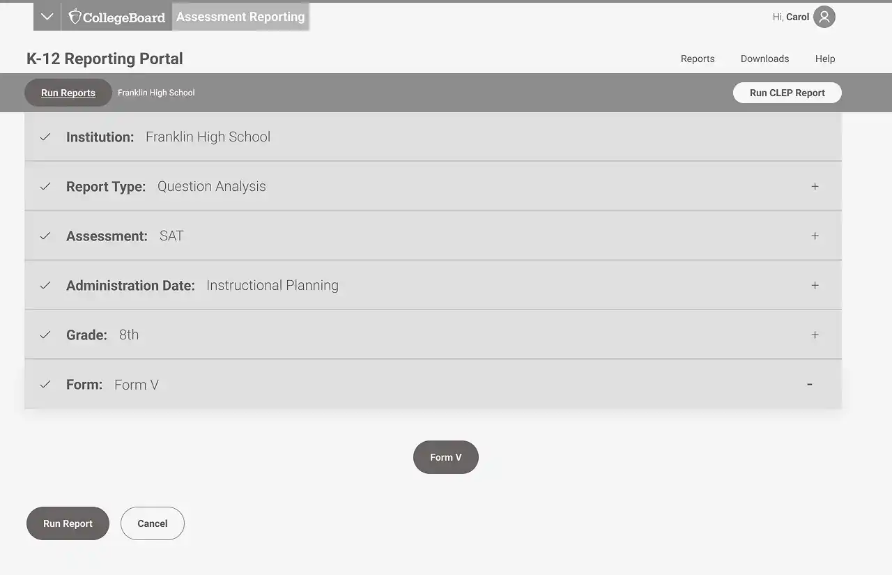
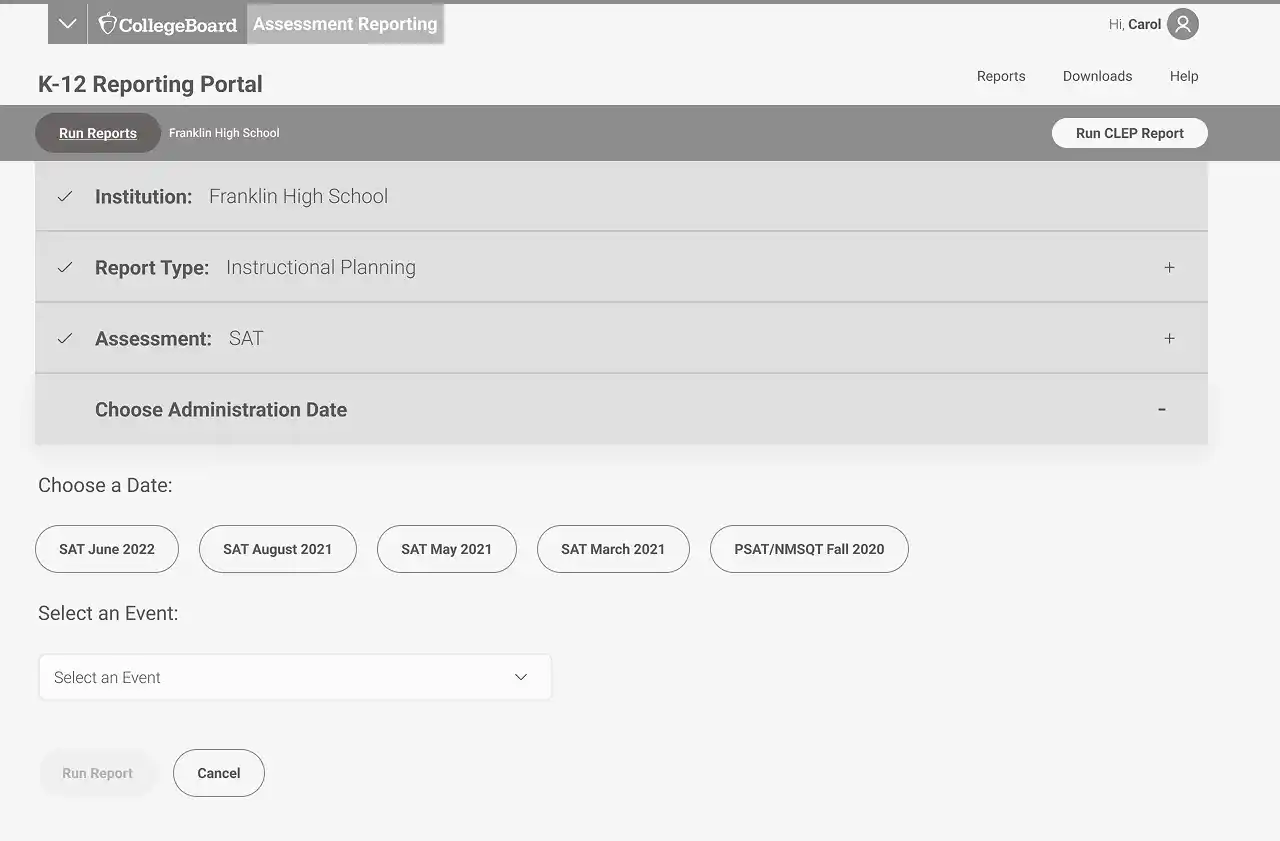
1. Decoupled Report Types for Clarity
We restructured the information architecture around data needs —separating aggregate and individual reports. This removed redundancy, made navigation more intuitive, and surfaced the right data at the right time.
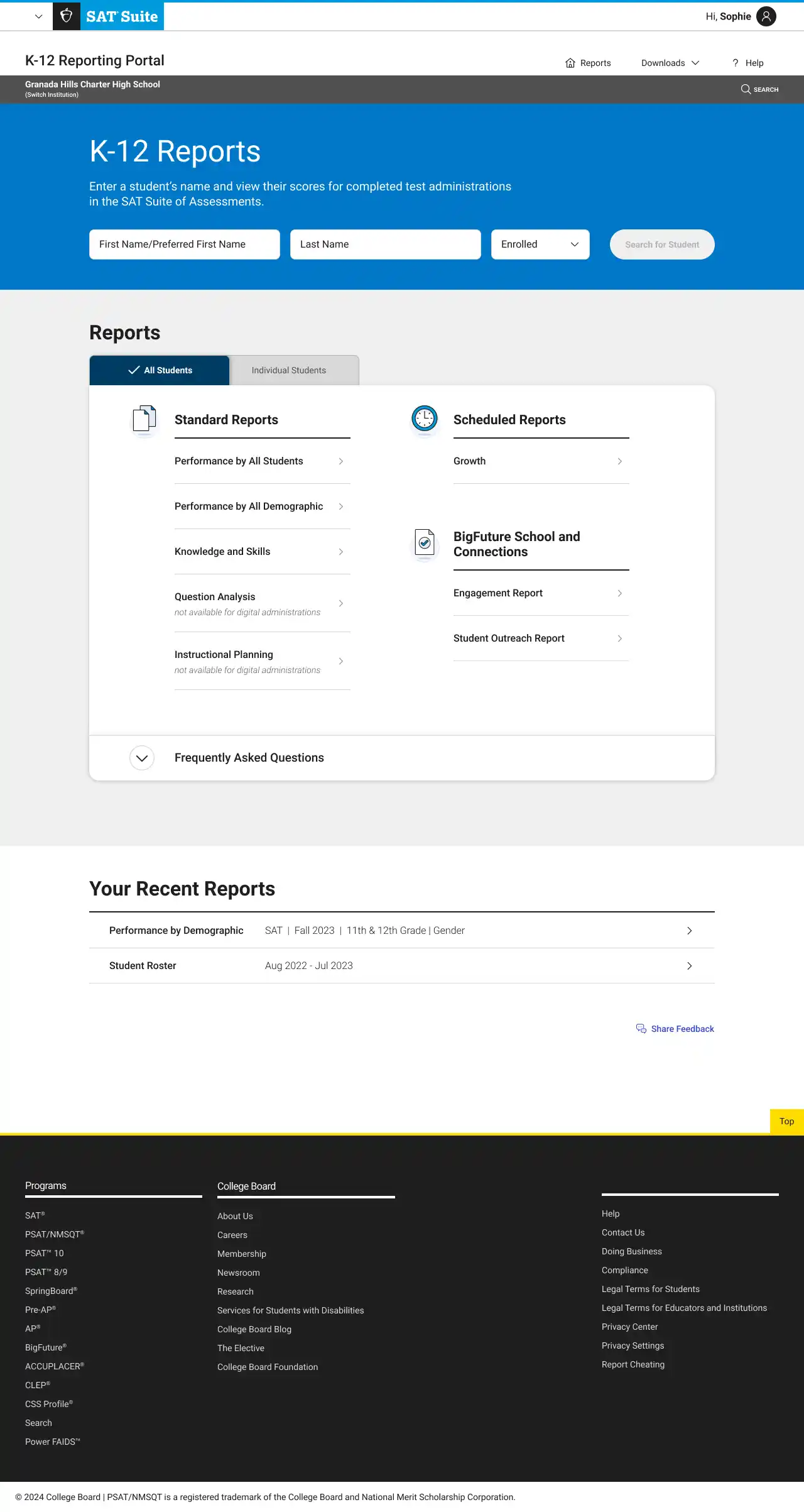
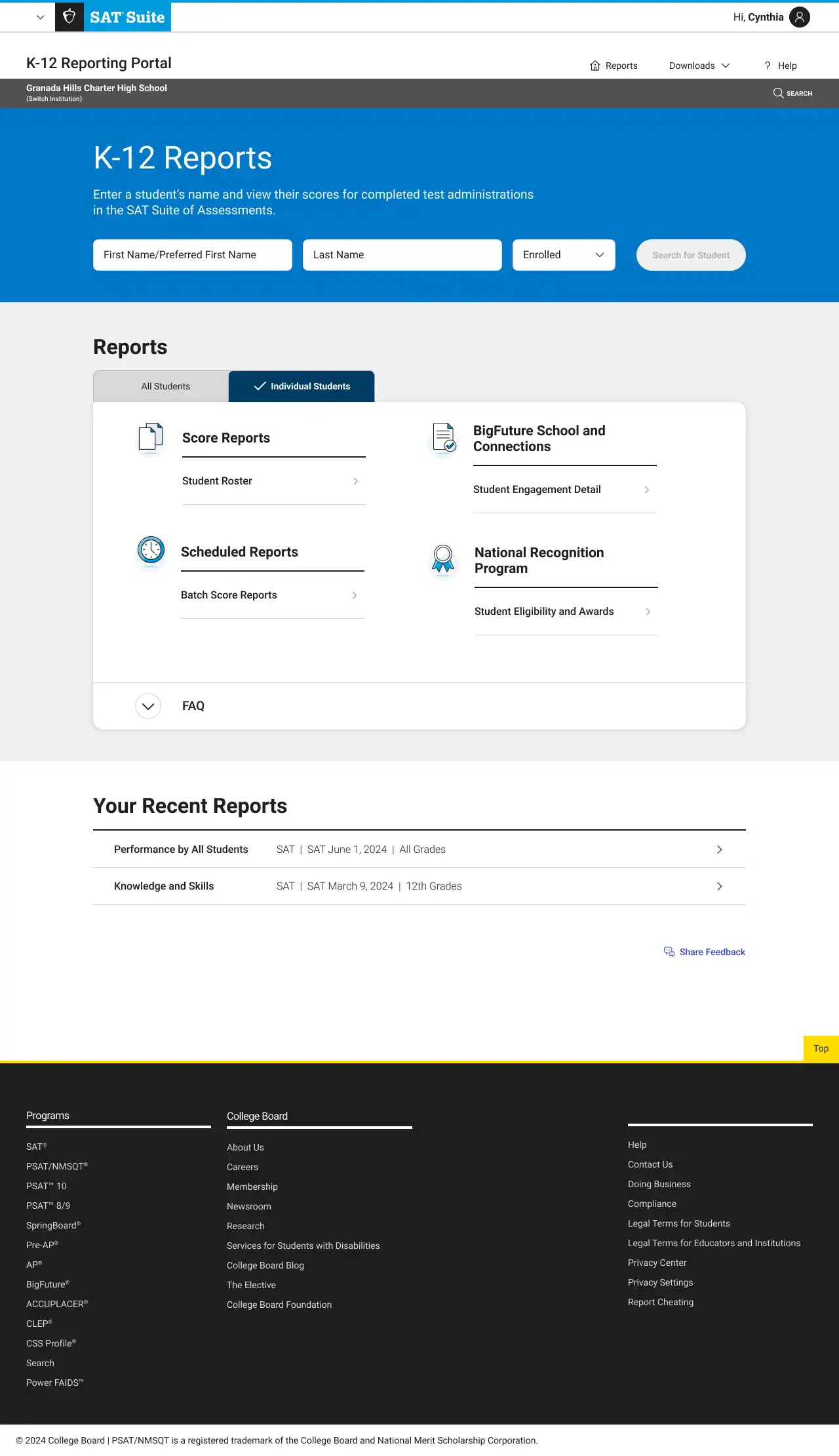
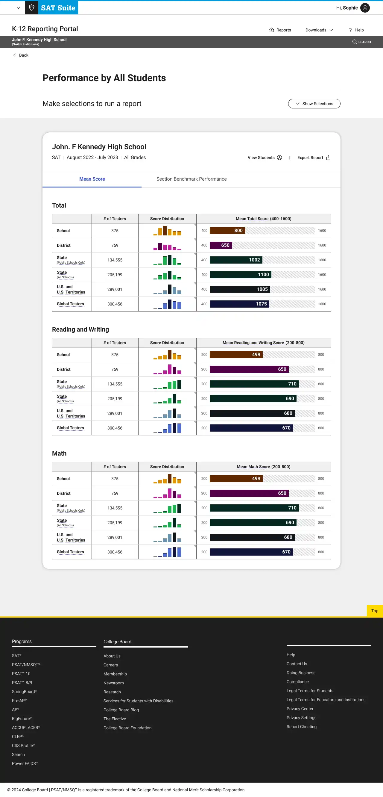
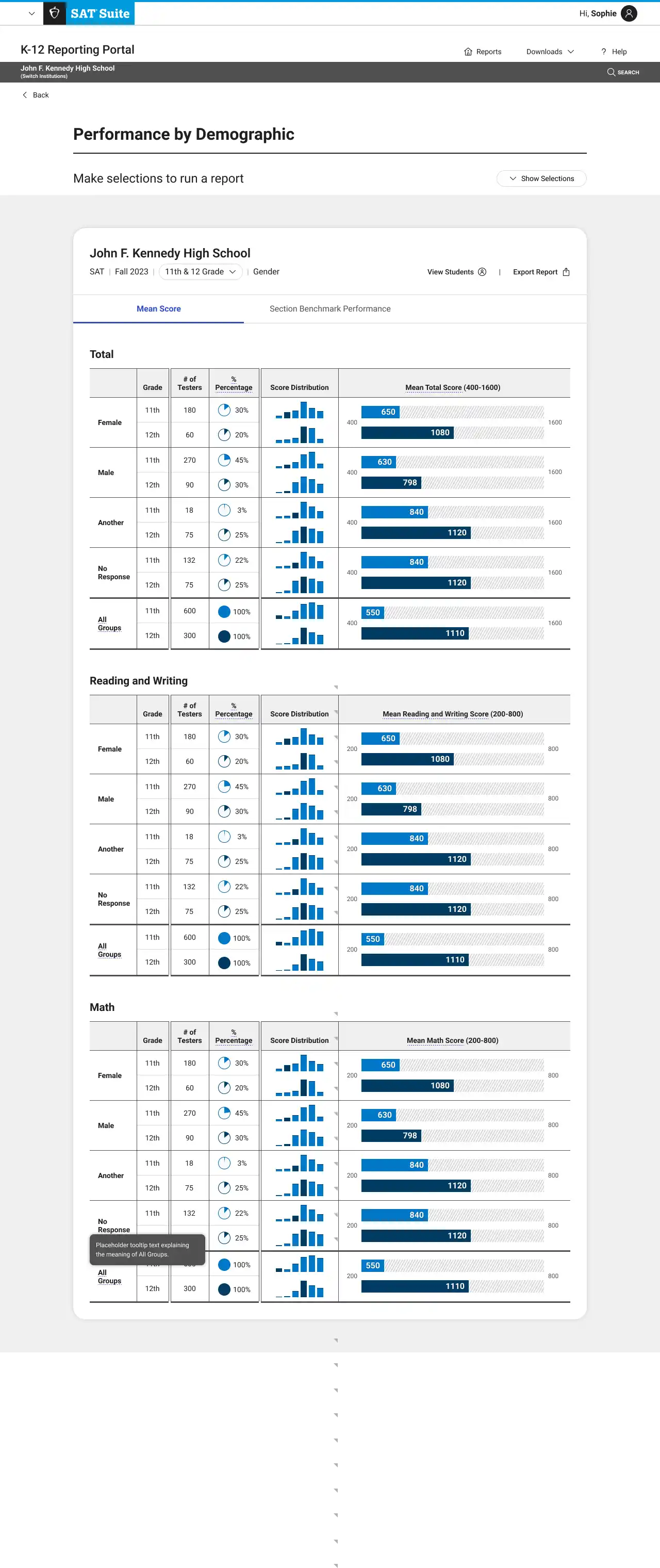
2. Redesigned Core Reports & Visualizations
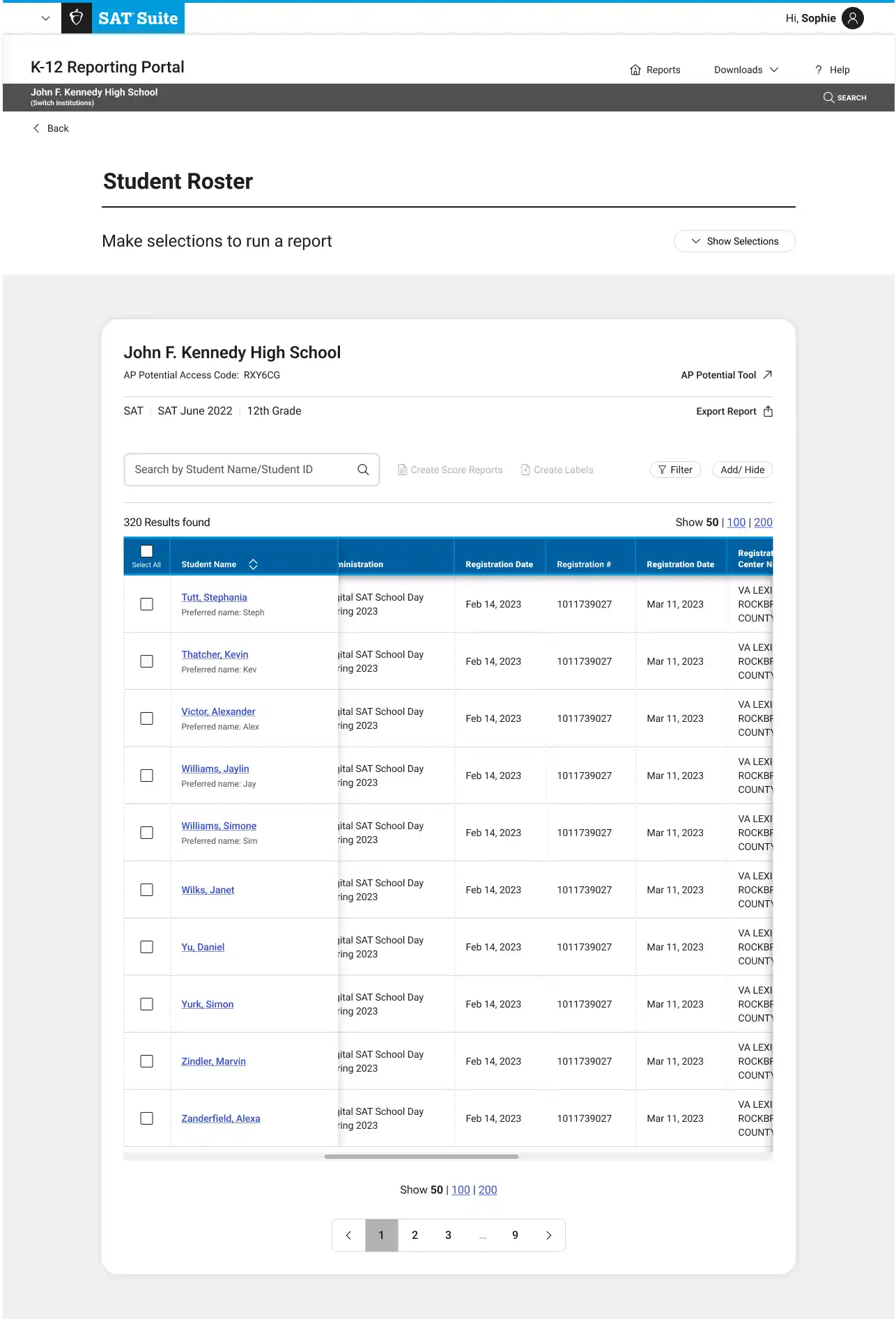
We overhauled the most-used reports—Performance by All Students, Demographics, and Student Roster—enhancing visual clarity, data visualizations, and additional functionality.
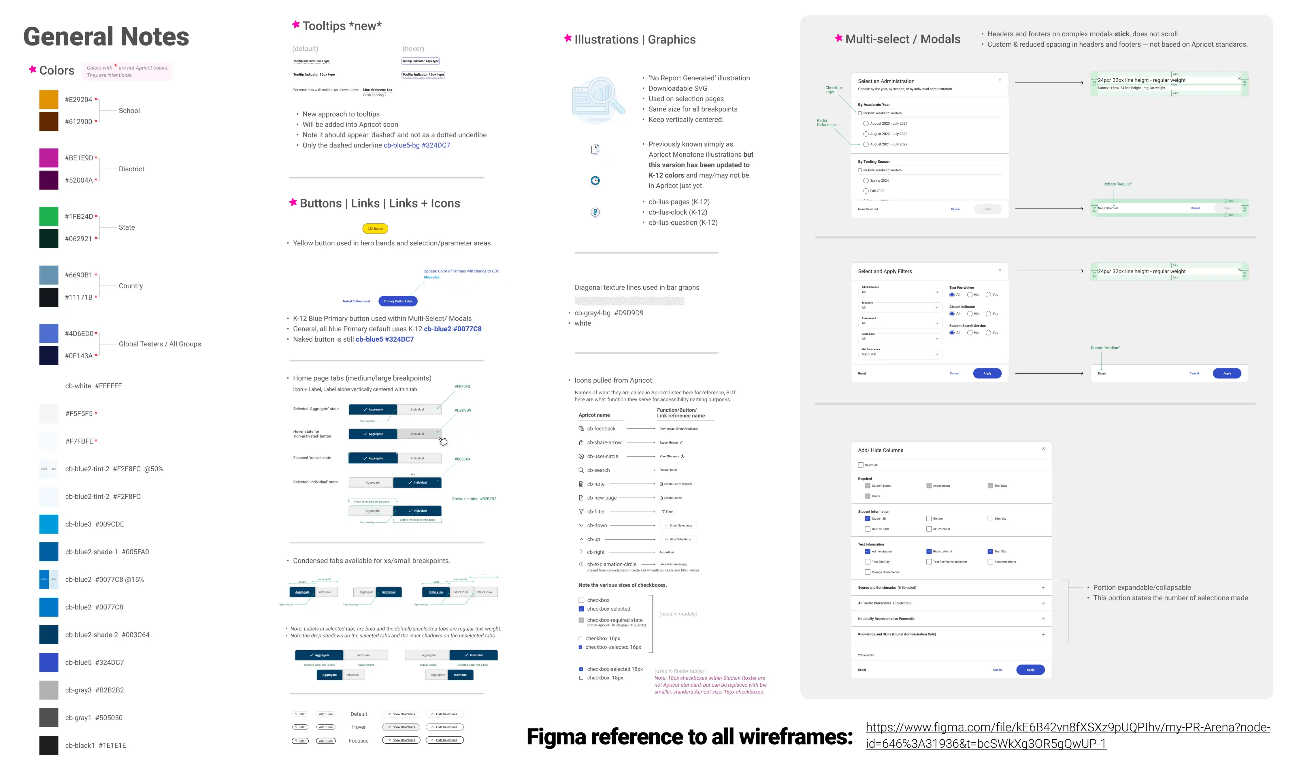
3. Leveraged Accessible Design System
I worked with a visual designer to insure we were in compliance with College Board's design system Apricot. Leveraging existing components helped us scale quickly. The components that are created are vetted by our in-house accessibility expert to insure WCAG compliance. We worked together with development to insure that our designs were accessible for screen readers, and worked with color contrast and keyboard navigation.
Design Specs

With these strategies, I created user flows for the portal across 3 different user types - school, district, and state users.
MVP Screen Flows (Overview)


After launch, I created designed additional reports for BigFuture and the National Recognition Program.
At launch, College Board’s K–12 team had no formal UX research practice. Feedback was sporadic, disconnected from roadmaps, and often arrived too late to influence outcomes.
I led the shift toward a structured, scalable research model—embedding continuous discovery into the product lifecycle and giving educators a durable voice in strategic planning.
🧪 From Ad Hoc to Scalable Research
We established a reliable cadence of 8–10 research initiatives per year, including:
Quantitative Surveys – Academic Year 2023-2024, Academic Year 2024-2025, post report launch surveys
In-Depth Interviews – With school leaders, district admins, counselors, and teachers
Usability Testing – Section Benchmark graphs, navigation flows, exports, help
Language & Terminology Studies – To validate report titles and UI content
Open-Comment Analysis – Synthesized over 1,000 survey comments into actionable themes
This approach uncovered hidden pain points, aligned cross-functional teams around real user needs, and grounded product decisions in evidence.
📌 UX Backlog
I introduced a living UX backlog to prioritize design opportunities by:
User-critical tasks
Technical feasibility
Strategic alignment
This helped the team shift from reactive fixes to roadmap-aligned improvements.
🔍 Research Backlog
We also launched a research backlog to capture open questions, clarify unknowns, and ensure each product bet was backed by intentional learning goals.
After launch, we measured impact through analytics, educator interviews, and a Academic Year 2023-2024 survey (n ≈ 1,100) and Academic Year 2024-2025 (n ≈ 1,300).
✅ Clear Wins
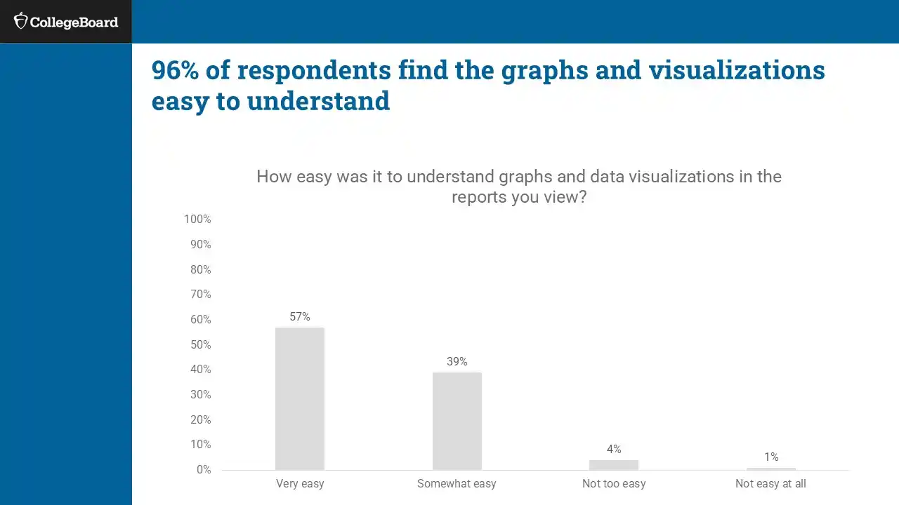
96%
Found visualizations easy to understand.
A consistent strength that helped educators quickly interpret key data points.
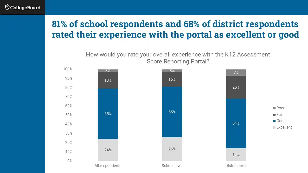
81%
School users rated the portal as good or excellent.
Core users reported high overall satisfaction.
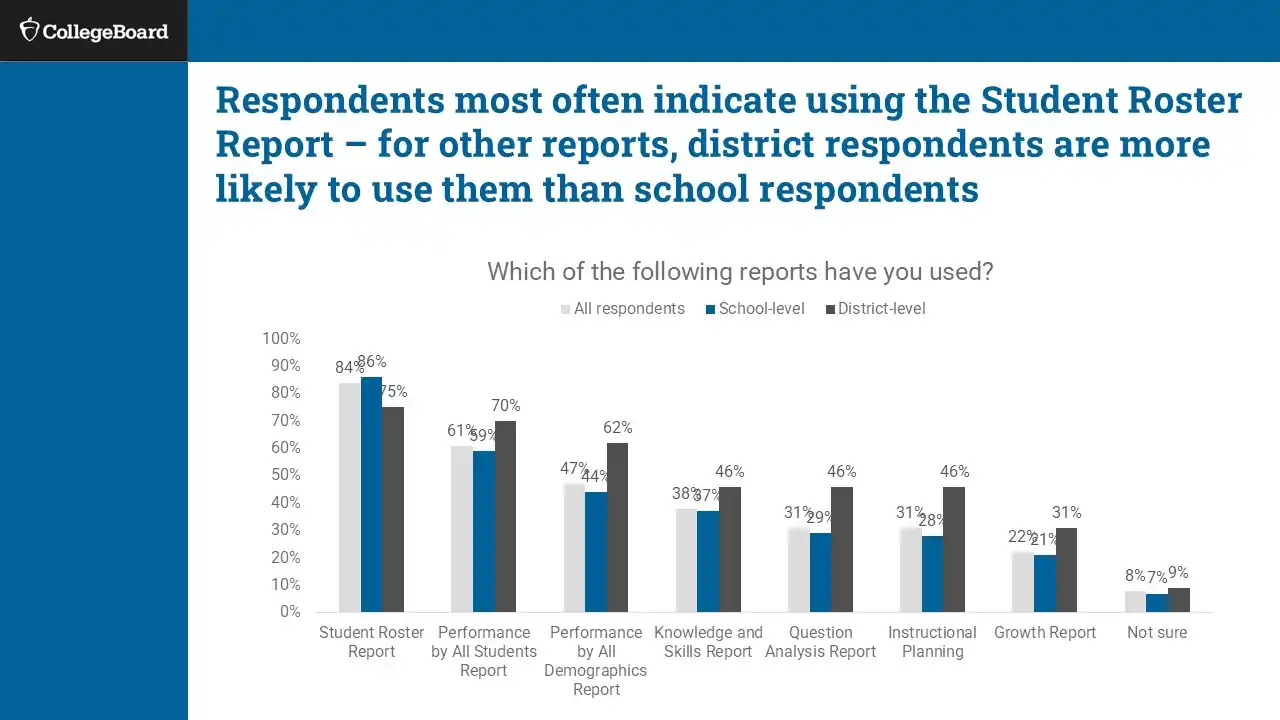
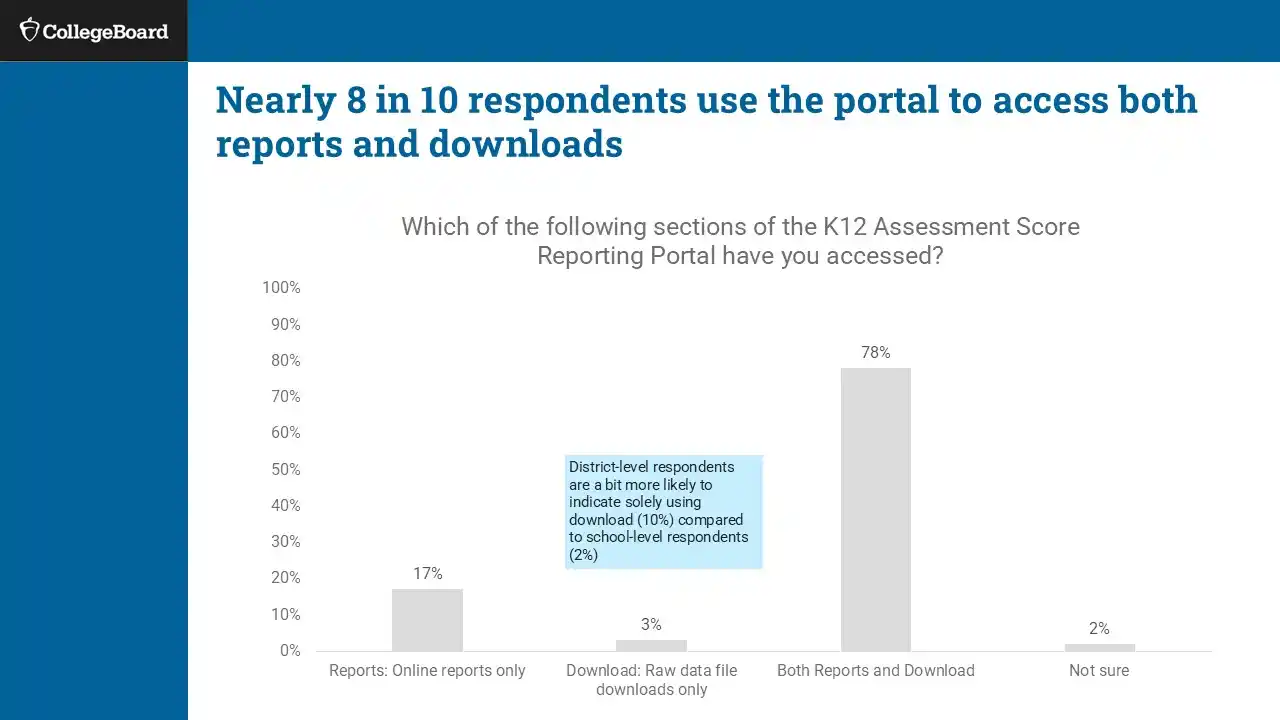
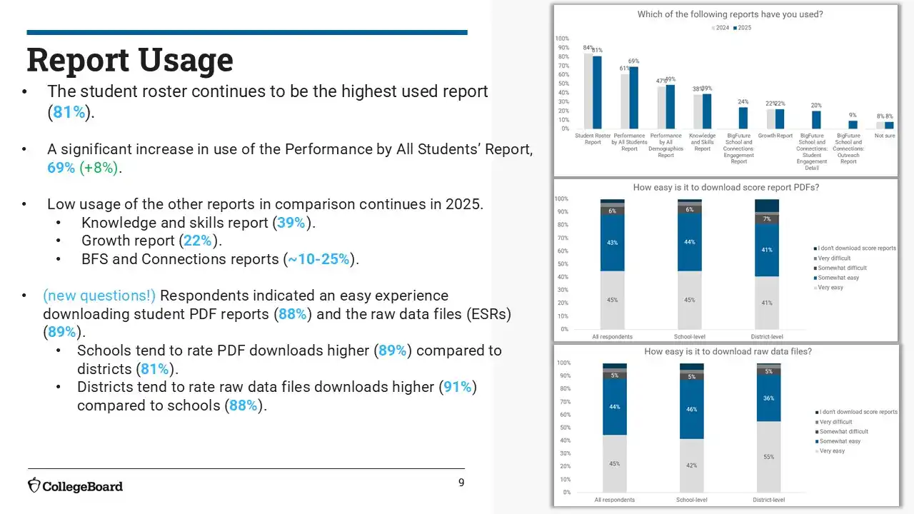
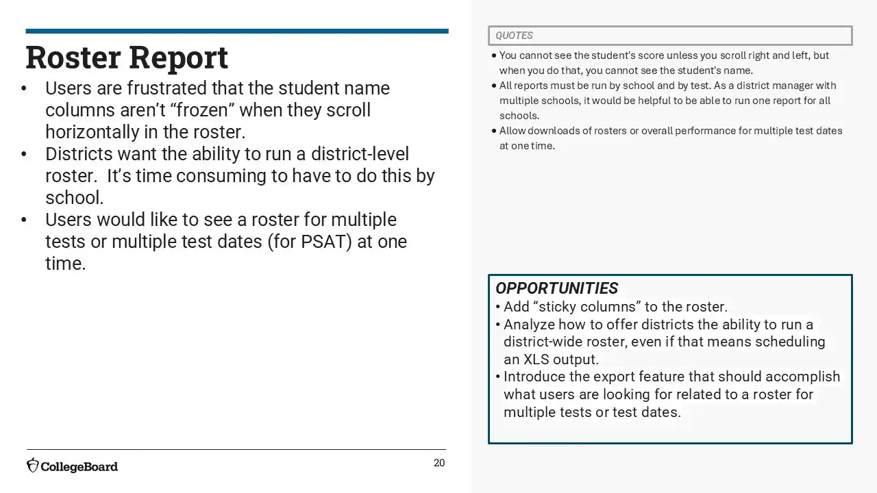
81%
Accessed the Student Roster report
Confirmed its critical role in day-to-day data tasks for schools and districts as the most used report in the portal
+8%
Increase in usage of the Performance by All Students report
Growth in adoption showed traction for redesigned, aggregate-level reporting.
89%
Successfully downloaded PDFs or raw data files.
Most users found report exports reliable and accessible post-score release.
⚠️ What Still Caused Friction
Navigation & Wayfinding
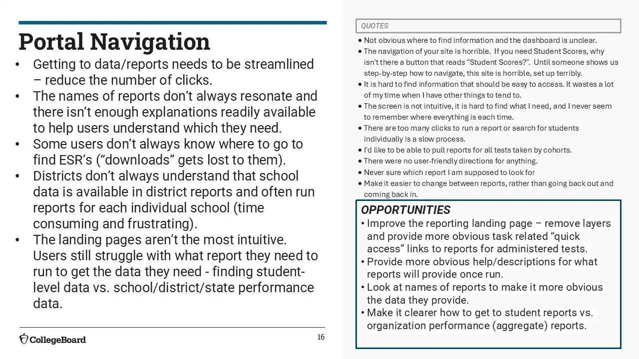
Navigation improved on paper (76% good/excellent in 2024-2025), but feedback still described it as unintuitive and click-heavy. Report names were unclear, and users struggled to locate specific reports or return to prior searches. 2024-2025 survey users reported more workflow friction. Multi-click flows, confusing paths, and a lack of shortcuts slowed tasks. Key actions like printing or exporting were still buried.
Instructional Use & Trends
Educators continued to find reports too broad for instructional planning. The loss of item-level detail, like the Question Analysis Report, was a major gap. Skills Insight and Knowledge & Skills reports lacked actionable insights. The portal didn’t support year-over-year analysis or class-level insights. Teachers lacked visibility into specific skills and trends. Many created external visuals to track performance over time.
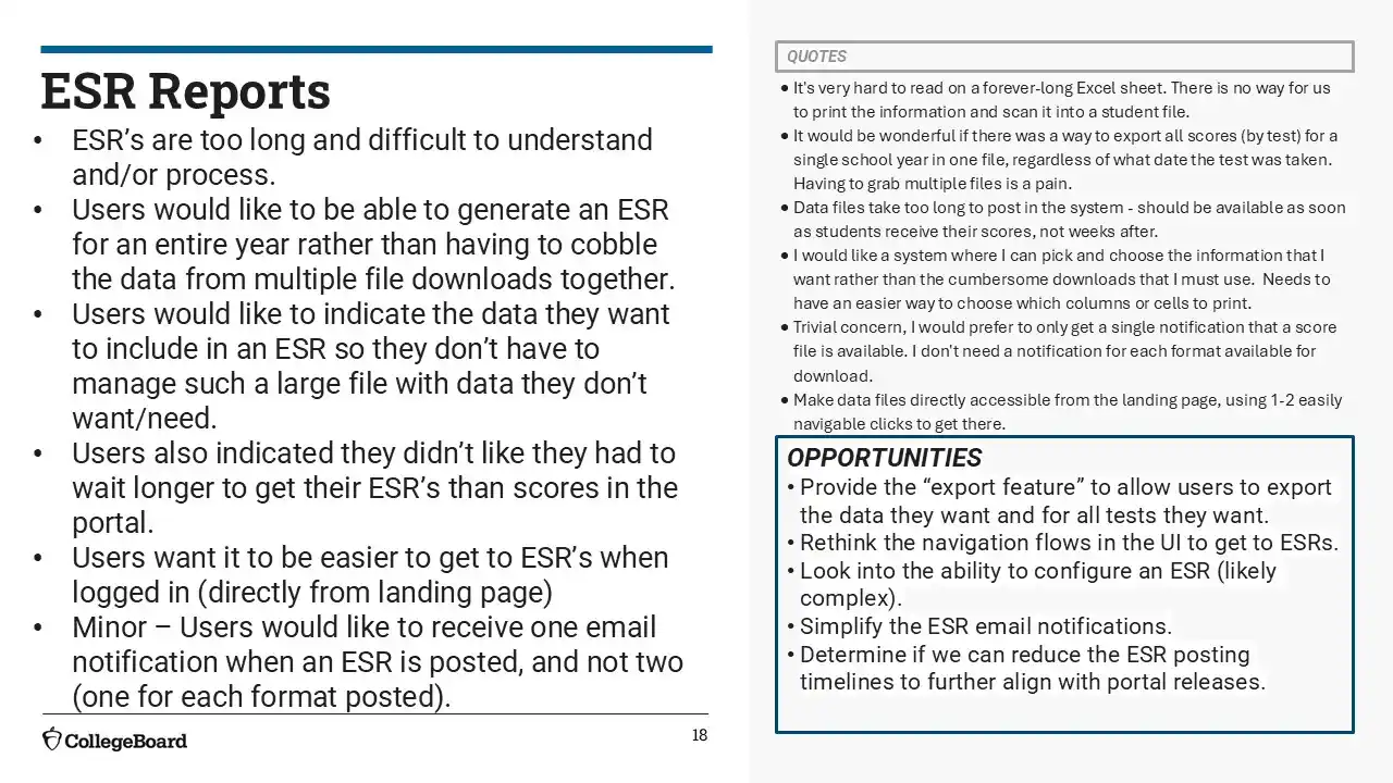
Exporting and Score Reports
Users still couldn’t bulk download or easily filter reports by year, test date, or school. ESRs were hard to navigate and customize. Manual data stitching remained common.
Demographic Reporting
Demographic options were limited and didn’t align with school systems. Educators wanted filters for SES, SPED, ELL, and customizable uploads. The current structure made subgroup analysis difficult.
2023-2024 Survey

2024-2025 Survey


Post-MVP launch, we engaged over 50 school and district leaders throughout the year to understand how they were using the K-12 Reporting Portal in practice.
I synthesized this qualitative feedback into themes and pain points, then facilitated collaborative analysis workshops with product, content, engineering, and visual design to align on key insights. These sessions helped us prioritize usability issues and identify opportunities for improvement across navigation, data interpretation, and terminology.
Jan 2024 Collaborative Analysis
✅ Clear Wins
Graph Clarity
Educators consistently praised the Mean Score graphs in both the “Performance by All Students” and “Performance by Demographics” reports.
Export Functionality
Users appreciated being able to export data to Excel or integrate it with internal systems like Tableau.
Email Notifications
Report availability emails were highly valued, especially by district users responsible for maintaining records or distributing reports.
Familiarity with ‘Performance by All Students’
Most users gravitated toward this report as their main entry point into student-level data. It’s familiar, reliable, and flexible.
⚠️ What Still Caused Friction
Navigation and Discoverability
Educators struggled to find key features like the Student Roster unless they already knew to click through specific reports. The homepage didn’t guide them clearly.
Help Content Gaps
The FAQ and Help sections were hard to locate and lacked practical guidance. Users wanted clearer step-by-step instructions or contextual support.
Confusing Terminology & Structure
Report names like “Individual Reports” or tabs labeled “Performance by All Demographics” caused confusion. Users weren’t sure what to expect and often misclicked.
Overwhelming Excel Exports
Some users found the raw data exports dense and difficult to work with. They wanted pre-filtering or the ability to customize columns before downloading.
💬 What Educators Told Us
“If you haven't played around with it, the learning curve is a little steep.”
“Once you know where to go, it’s fine—but there’s no roadmap.”
“Clean layout, but too many clicks to get to the actual student data.”
🚧 The Takeaway
User interviews mirrored issues that were surfaced in the 2023-2024 and 2024-2025 surveys, especially less frequent users. Observing users in how they achieve their tasks provided insight into context as well
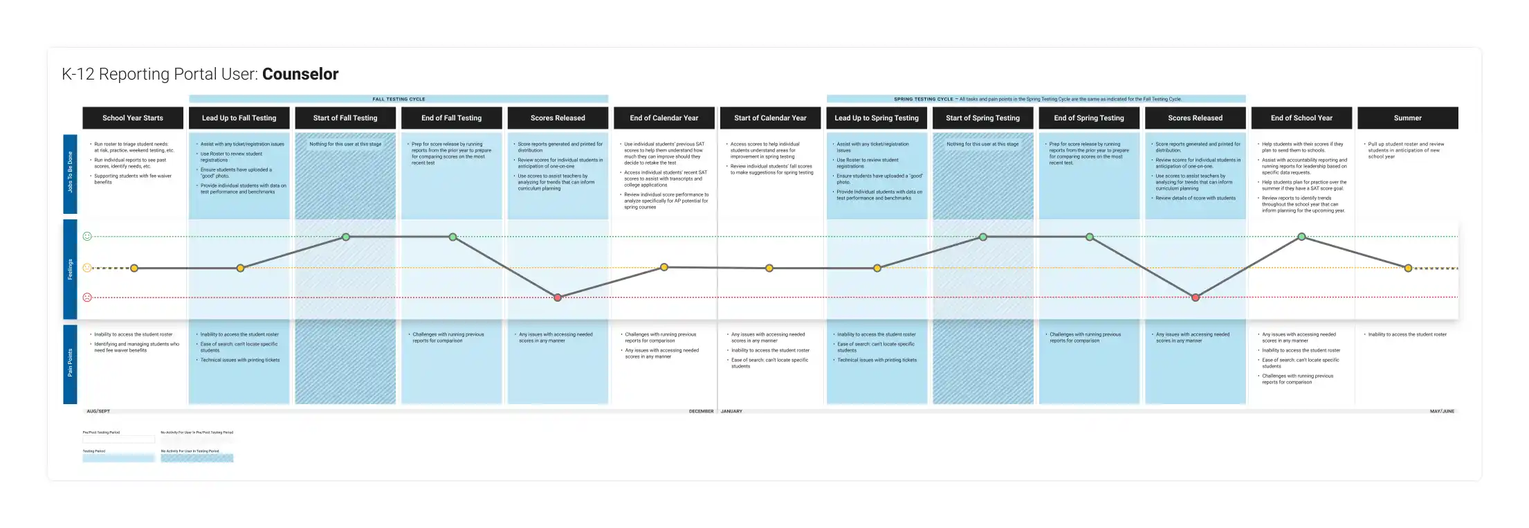
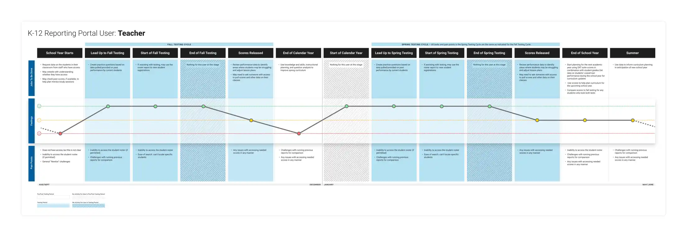
Based on survey results and user interviews, we began to focus and flesh out user types, since behavior, goals, and pain points varied dramatically across roles. I led the effort to develop a grounded, research-based understanding of our users, identifying 3 primary user types
Primary User Types
Role | 🎯 Goals | ⚠️ Pain Points | 💡 Needs | 🔄 Workarounds |
|---|---|---|---|---|
Counselors | Access scores quickly to support academic advising, college planning, and family communication. | Slow load times, hard-to-find student reports, and clunky printing options disrupt their workflow. | Simplify navigation, speed up performance, and offer print/export tools designed for 1:1 meeting | Counselors often take screenshots or manually track student data due to system friction. |
Administrators | Monitor school or district performance, disaggregate results, and guide decisions across cohorts. | Missing report types, inconsistent navigation, and limited historical comparisons stall strategic planning. | Reintroduce granular analysis tools and build easier access to multi-year, multi-group data. | Admins build custom spreadsheets or rely on data teams to fill the gaps left by portal limitations. |
Teachers | Use performance data to tailor instruction and support student learning growth. | Limited access to question-level detail, unclear visualizations, and messy exports hinder planning. | Bring back detailed Question Analysis, improve data clarity, and streamline exports for easier use. | Teachers dig through multiple reports or use screenshots and spreadsheets to compensate for missing insights. |
Secondary User types
Test Coordinators: Handle logistics, manage access, support others
State Leaders: Infrequent but critical—need fast access to high-level summaries
Data Analysts: Pull raw exports, analyze in external tools (e.g., Excel, Tableau)
We mapped real educator workflows—and uncovered friction that ran deeper than just UI design.
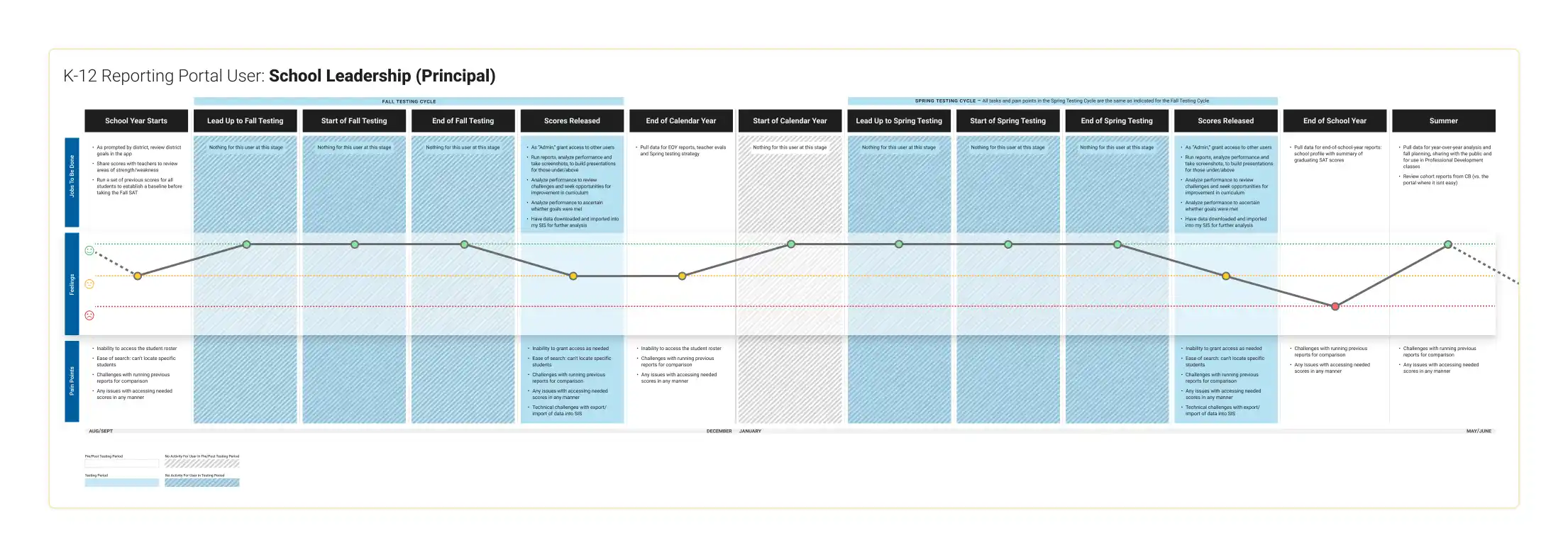
After defining user types, I led journey mapping sessions to look at the user journey through the academic school year. The K12 Reporting Portal would typically have two busy times of the year where most educators are using the portal - after Fall and Spring score release. Some common themes emerged for all primary user types:
Rosters & Reports Are Buried or Inaccessible: All roles struggle to find the right reports at the right time, especially the student roster.
Lack of Longitudinal Comparison: Whether for district analysis, student advising, or instruction, year-over-year data is hard to access.
Export Complexity: Raw exports are too messy or incomplete for use without significant cleanup.
Search & Filtering Deficiencies: Users can't easily zero in on students or subgroups—costly for roles like counselors and teachers.
Journey Maps
As we synthesized journey maps, interviews, and survey feedback, a deeper pattern emerged: educators weren’t just frustrated by the portal itself—they were reacting to a fragmented, inconsistent ecosystem.
The user experience doesn’t begin on the K–12 Reporting Portal homepage. It starts with logging in, navigating access systems, and jumping between College Board tools. Survey data made it clear: some of the biggest pain points lived outside the portal—broken access flows, siloed products, and poor customer support. These issues created a negative “halo effect,” undermining the portal’s perceived value regardless of what we improved within it.
🔐 The Access Management
The access system—outside of our product—was one of the most disruptive parts of the user experience.
Users described the process of gaining or assigning access as confusing, time-consuming, and often illogical. Annual expirations forced them to repeat the process every year, and the rigid, unclear role structure made it difficult to manage access efficiently.
Survey Comments
“I had six different case numbers for the same unresolved request for a district access code.”
“I was told I had to ‘grant myself permission’ as the access manager—it made no sense.”
“My access gets revoked every year and since I don’t login frequently I’m always frustrated that I need to call in to re-enable it.”
“I hate that I have to go through a whole thing to get access every year!”
“There needs to be a district admin role. Right now, I have to go through every principal, which is inefficient.”
🧩 The Siloed Experience
College Board tools operate as separate systems with little integration—leading to redundant workflows, multiple logins, and inconsistent design.
Users expect a cohesive platform, but instead navigate a fractured experience that slows them down and increases cognitive load.
Survey Comments
“I should be able to log into one account for all tools—test ordering, score reporting, AP resources.”
“I wish AP reporting was in the same portal—one less login, one less place to go.”
“We can see SAT scores, but we cannot see AP scores. Counselors should absolutely have access to both.”
“The AP reporting site is cleaner in how it organizes district reports. I wish the two portals acted the same.”
🧠 The Realization
These weren’t isolated friction points—they reflected a broader misalignment between how College Board is structured internally and how educators experience its tools externally.
This realization marked a turning point in our design strategy. While we focused on improving the portal itself, we also expanded our lens to consider cross-product workflows and educator context.
Some systemic issues—like access management—were outside our direct control, but I made a concerted effort to reduce friction where possible and advocate for consistency across the broader educator experience.
Immediate Portal Improvements
After the MVP launch, we used research insights and user feedback to prioritize high-impact improvements that could be delivered quickly.
Our goal was to focus on changes that made the biggest difference for educators without overextending what the system could support.
🔧 Targeted UX Wins (Post-MVP Improvements)
One-Click Access to Core Data
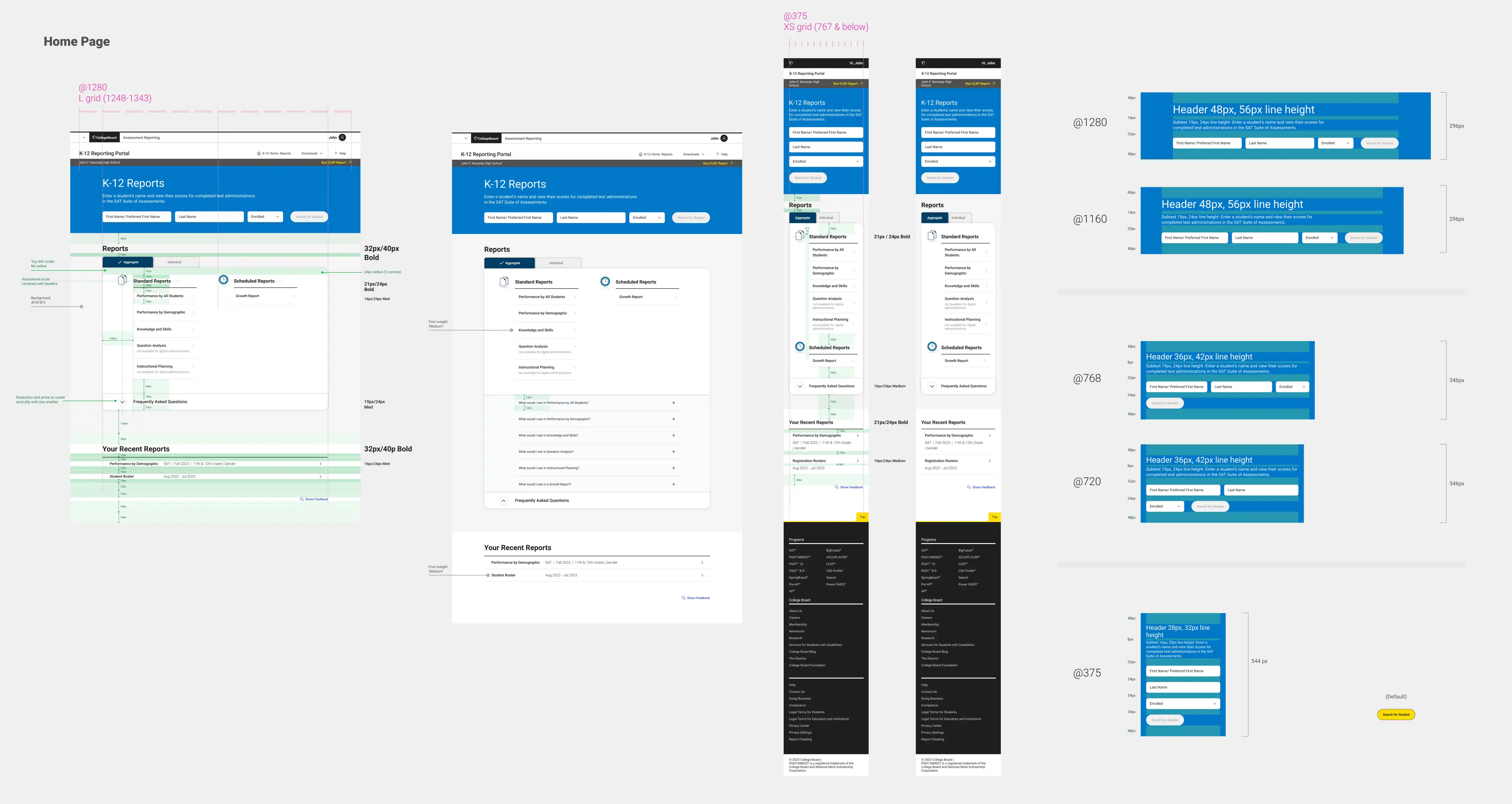
We redesigned the homepage so educators could immediately run their most recent reports with a single click—reflecting the feedback from our user interviews and surveys. From there, users could refine filters as needed, helping them get to actionable data faster and with less effort.
Unified Single-Page Structure
To improve discoverability, we introduced a centralized, scrollable dashboard that surfaced multiple key reports in one place.
Custom Data Export (Reintroduced & Refined)
Originally included in the MVP, custom export had to be temporarily removed due to engineering resources. In this redesign, we brought it back, allowing users to select key fields and cohorts while ensuring system stability.
Elevating High-Value Actions
We made common tasks—like generating rosters, downloading PDFs, and viewing the most recent test administration—more prominent across the portal. These updates were based on observed behavior and aimed to reduce clicks and friction for frequent users.
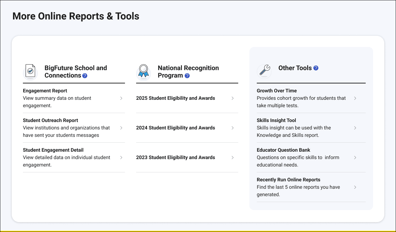
Contextual Help & Guidance
To support less frequent users, we introduced inline help in section titles as well as the report themselves. These additions helped reduce confusion and reliance on external training.
Homepage Redesign
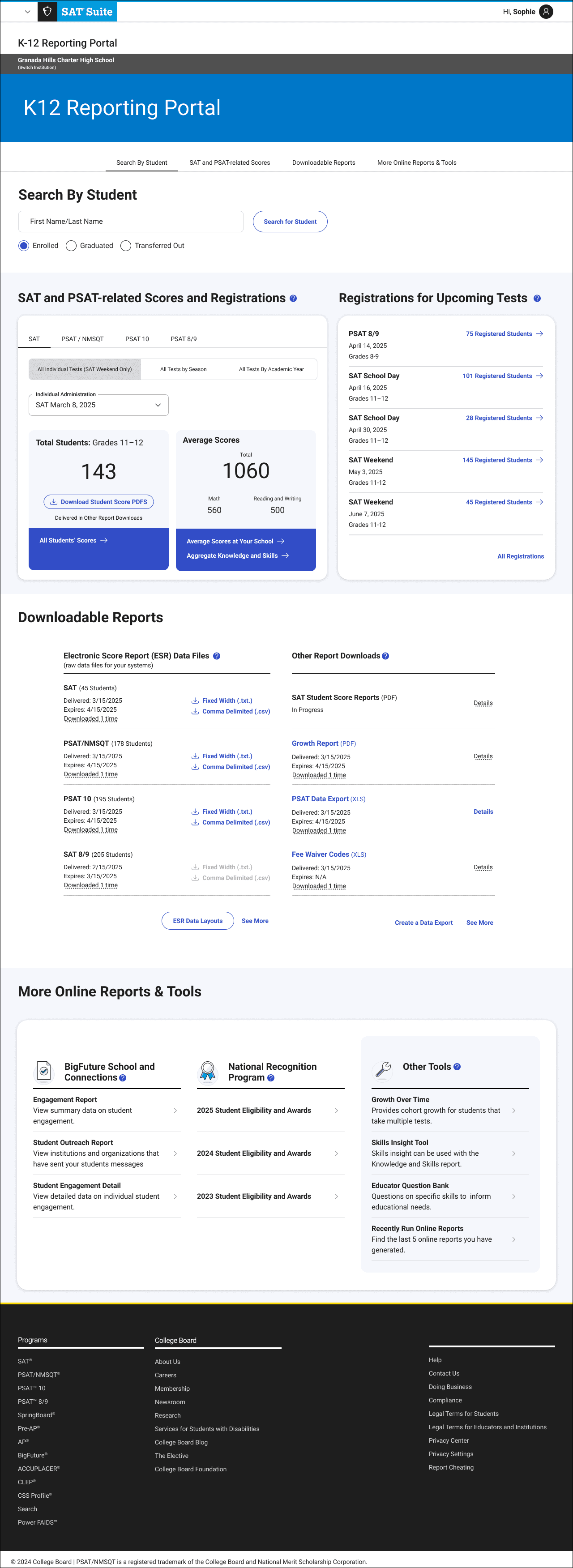
Homepage Redesign (By Section)


These improvements didn’t solve everything—but they meaningfully improved how quickly and clearly educators could complete their most common reporting tasks, especially around recent test administrations and student-level data access.
What Improved—And What Didn’t
We ran an unmoderated usability test with a sample size of 45 school and district users to see if the new design addressed the issues from the existing design.
✅ Clear Wins
67.5%
Described new layout as easier to use
2/3 of users said the portal was “a lot easier” or “slightly easier” to navigate than the previous portal.
89%
Successfully downloaded PDFs or raw data files
Participants completed these tasks quickly, with download links clearly labeled and accessible.
95%
Easily located student search
Nearly all users found and used the student search bar immediately, rating the task highly for ease.
4.6 / 5
Ease of finding electronic score reports (ESRs)
Users rated this task highly, with most finding the ESR section straightforward and easy to navigate.
4.5 / 5
Finding school-level averages
The “Average Scores at Your School” link performed well, helping users complete the task with minimal confusion.
⚠️ What Still Caused Friction
Mixed Perceptions from the minority.
While most users saw the redesign as an improvement, about 12% found it slightly harder to use, and 20% said it felt “about the same.” These responses were generally tied to layout density or needing to re-learn where things are.
“Still requires you to know what to look for, but seems more intuitive.”
“It’s not harder, just takes getting used to.”
Some Users Felt Overwhelmed by Content
While the dashboard consolidated tools, a few users—particularly those newer to the system—found the density of information slightly overwhelming. A handful recommended simplifying or reorganizing the layout.
“There is a lot of information on the screen… maybe it could be grouped differently or spaced out a bit.”
“Would be easier to have one location just for reports.”
A Few Labels Caused Uncertainty
Though most labels were clear, some users hesitated when interpreting titles like “All Students’ Scores” or “Average Scores at Your School.” This didn’t block task success, but a few felt unsure if they were choosing the right option.
“I guessed that ‘All Students’ would give me a list.”
“Not sure if it’s a report I need to run or a download.”
Minor Visibility Issues for Custom Exports
The “Create a Custom Data Export” link was functional, but its lower placement meant a few users missed it on first scan. Suggestions included making it more prominent or grouping it under a broader reports section.
“Didn’t see the custom export link until I scrolled back up.”
“Would expect that option to be closer to the top.”
🧠 Representative Quotes
“The new layout has all the choices on the homepage whereas in the old layout many choices were buried somewhere.”
“Search for a student is very clear.”
“Didn’t see the custom export link until I scrolled back up.”
“I guessed that ‘All Students’ would give me a list.”
“Still requires you to know what to look for, but seems more intuitive.”
📌 Takeaway Summary
We succeeded in surfacing key tasks like search, score access, and exports through a more unified and intuitive dashboard. Most users found the experience easier than before, with 67% rating it as an improvement. Still, opportunities remain to reduce visual clutter, clarify select report names, and fine-tune layout structure—especially for infrequent users or those unfamiliar with College Board terminology.