Sony Reader
Role
UI Designer
This case study demonstrates how strategic visual design can adapt to innovative hardware constraints while maintaining usability and brand consistency. Through thoughtful layout strategies and platform-aware design decisions, we created reading experiences that embraced rather than fought against unique device form factors.
In the early 2010s, the tablet and e-reader landscape was evolving quickly. The iPad was setting new standards, Amazon dominated digital reading, and Sony was working to reclaim its place in both hardware and design. They introduced the Tablet S—with its distinctive ergonomic form—and the experimental Tablet P, a foldable dual-screen device. At the same time, the PRS-T1 brought wireless downloads to Sony’s E-Ink readers for the first time.
Sony’s vision was ambitious: create a unified reading experience that felt seamless across every device—whether it was a premium Android tablet, a quirky clamshell, or a no-frills E-Ink display.
I worked on the visual design for the Sony Reader app across this diverse device lineup. The core challenge was delivering a consistent, content-first experience across different screens, operating systems, and international markets.
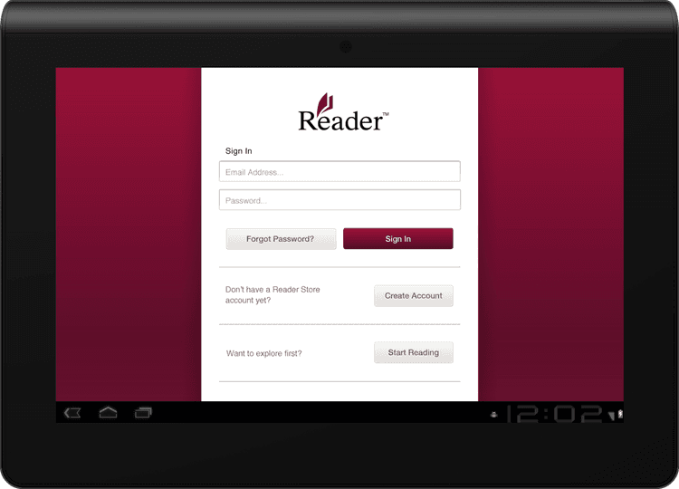
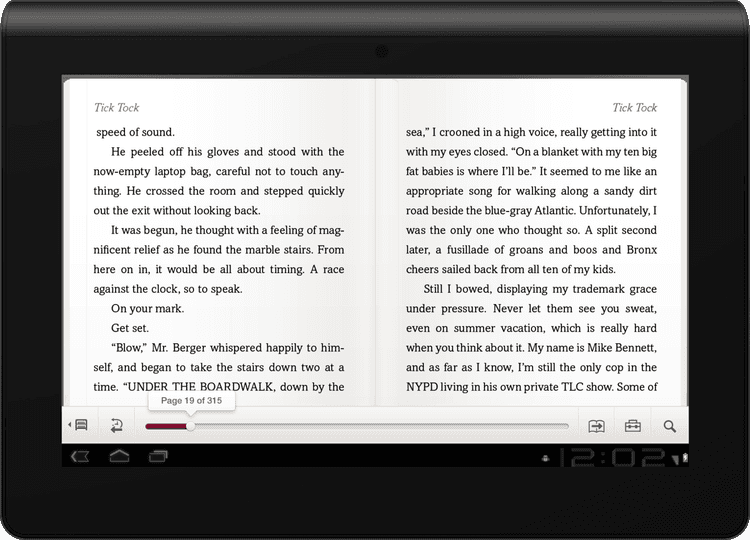
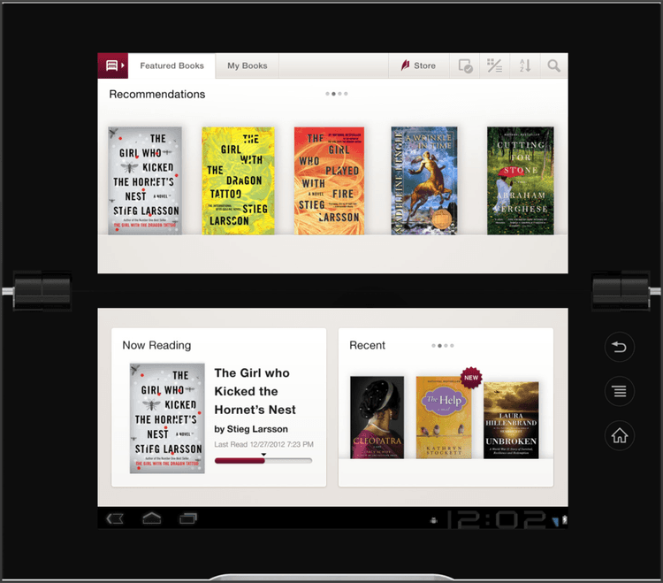
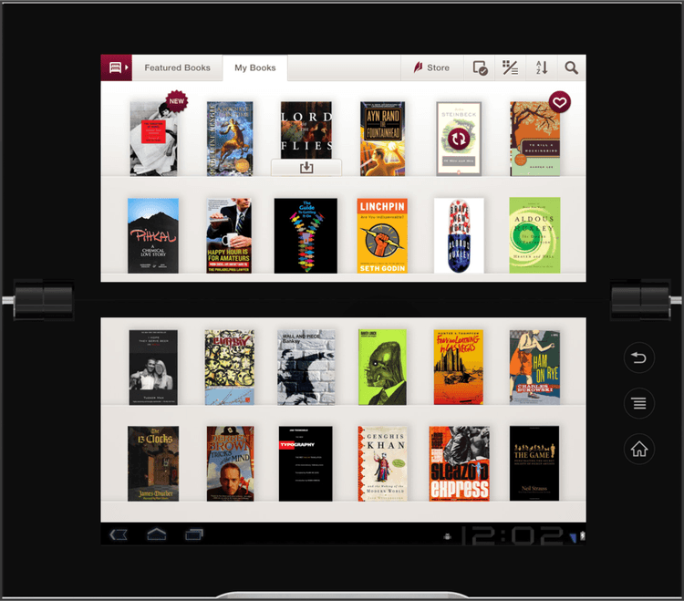
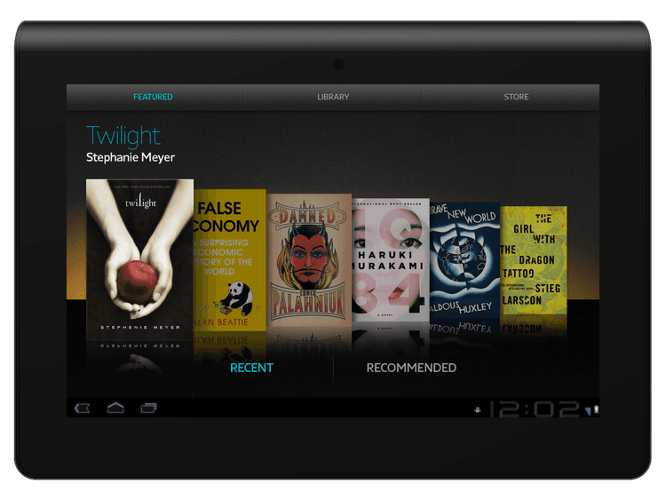
The Sony Tablet S was the company’s first modern Android tablet, and with it came the opportunity to define their approach to digital reading. I led visual design for the Reader app, creating a clean, library-first UI that was on brand for the Sony Reader brand —minimal use of brand color, generous whitespace, and a layout that let book covers take the lead.
Working within the limitations of an Android 2.x codebase (pre-Honeycomb), we adapted core flows for larger screens without access to modern tablet patterns. I also coordinated with mobile and iOS design teams to ensure visual consistency across platforms.
Localization and accessibility were key—we supported multiple languages and adjusted navigation for right-to-left reading in markets like Japan, collaborating closely with engineering teams abroad.
The Sony Reader application was a core launch app for the Tablet S, which won the CES “Best of Innovations” award.

Sony Tablet S


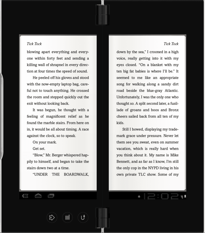
Designing for the foldable, dual-screen Tablet P came with some unusual challenges. The physical gap between screens meant rethinking layout, navigation, and how content flowed across the hinge—nothing could land awkwardly in the middle.
I focused on aligning the experience with the Tablet S Reader app to ensure consistency across devices, while carefully adjusting margins, gutters, and line breaks for readability and comfort. Interactive HTML prototypes helped us quickly test and refine the dual-screen behavior in both orientations.
Every screen—library view, reading mode, and controls—was evaluated for how it rendered when the device was open or closed. Collaboration with teams in California and Japan was challenging, but we made it work. The end result was a reading experience that respected the metaphor of a book while adapting smartly to the Tablet P’s unconventional format.
Sony Tablet S


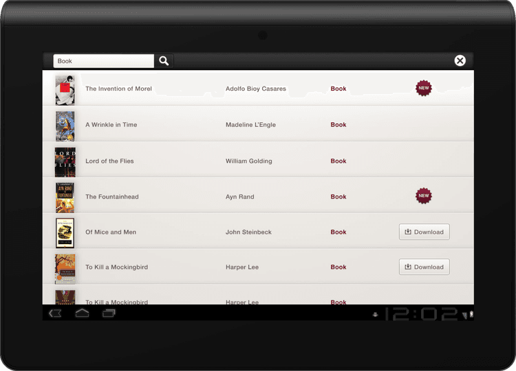
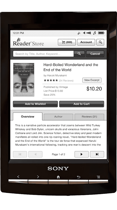
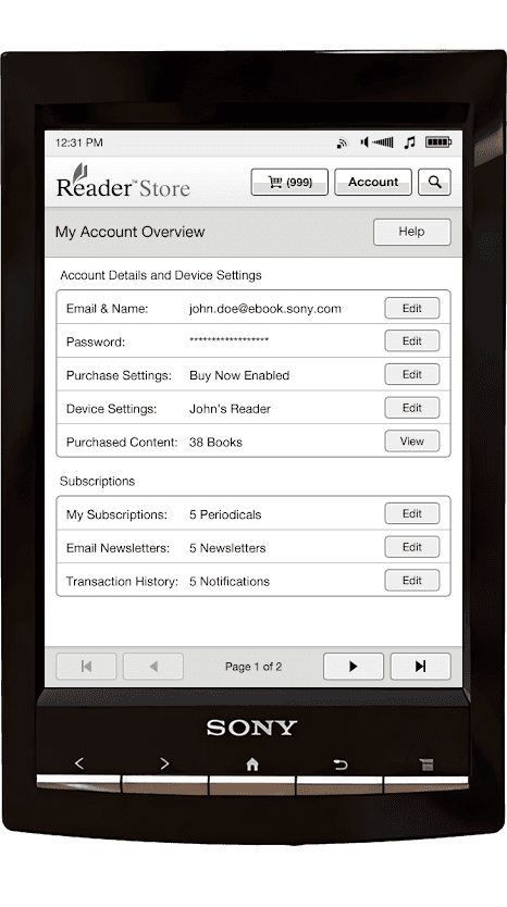
Designing for the E-Ink-based PRS-T1 meant working within tight technical constraints—grayscale display, low refresh rates, and no scrolling. The goal was to bring the Reader Store directly onto the device, so users could browse and purchase books without needing a computer.
I reimagined the Reader app UI for this environment, using high contrast, clean iconography, and paginated layouts to ensure speed and clarity. Every element was optimized to feel lightweight and predictable, making it easy to shop, read, and manage content on E-Ink for the first time.
Sony PRS-T1 Reader Store App

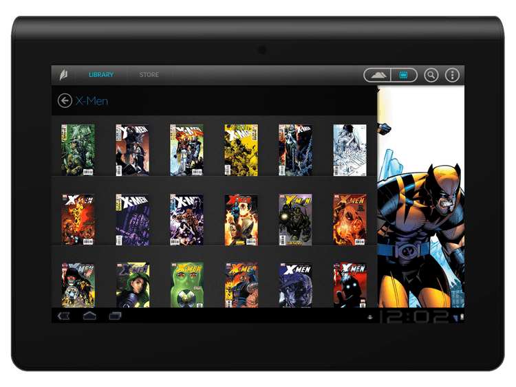
In the project’s final stretch, I worked on early concepts for the next evolution of the Reader app, as Sony looked to further modernize its content experience. My mockups explored richer layouts for comics and graphic novels, both light and dark themes, and more immersive carousels for featured content—setting the stage for Sony’s future tablet experiences.
Sony NXT Reader App

Launching these apps established a visually unified reading experience across Sony’s diverse device lineup, directly supporting Sony’s strategic multi-device ecosystem. The Tablet S had received industry recognition and we had helped launched Sony's first store on an e-ink device. Most importantly, the experience cemented my belief that delivering true cross-platform consistency means both honoring device differences and uniting teams around shared design principles.
Designing Sony’s digital reading suite taught me how to balance consistency and flexibility at scale—translating a cohesive vision across hardware that ranged from glossy tablets to monochrome E-Ink screens. This experience sharpened my systems thinking and how that scales across a diverse set of devices.