Wells Fargo Wallet
Role
UI Designer
Wells Fargo Wallet was launched to deliver a seamless, secure mobile payments experience to over 17 million banking customers across iOS and Android. As the Senior UX Visual Designer, I led the cross-platform visual design, expanded the design system, and drove accessibility standards for one of the largest digital audiences in U.S. banking.
By 2016, Wells Fargo had 17–18 million mobile banking users—making mobile its fastest-growing channel ever. With rising competition from Apple Pay and Google Wallet, the company needed a flagship product to retain users, drive engagement, and stay within its own ecosystem: enter Wells Fargo Wallet.
The product launched on both iOS and Android, with a strategic focus on Android—home to 38% of mobile banking users (6M+) and the most engaged segment, averaging 17 sessions per month.
I worked to coordinate UI design across three platforms and engineering teams, all while adhering to the bank’s strict enterprise design system.
My role was to design scalable, reusable components that worked across devices, aligned with platform patterns, and could be documented for use across Wells Fargo’s broader authenticated digital experience.
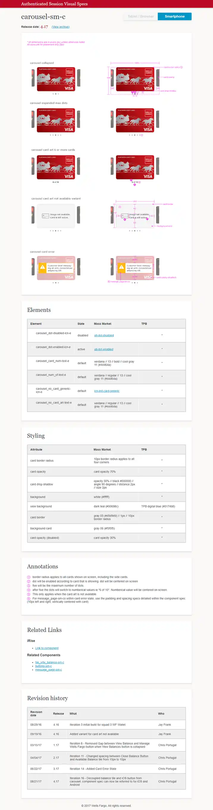
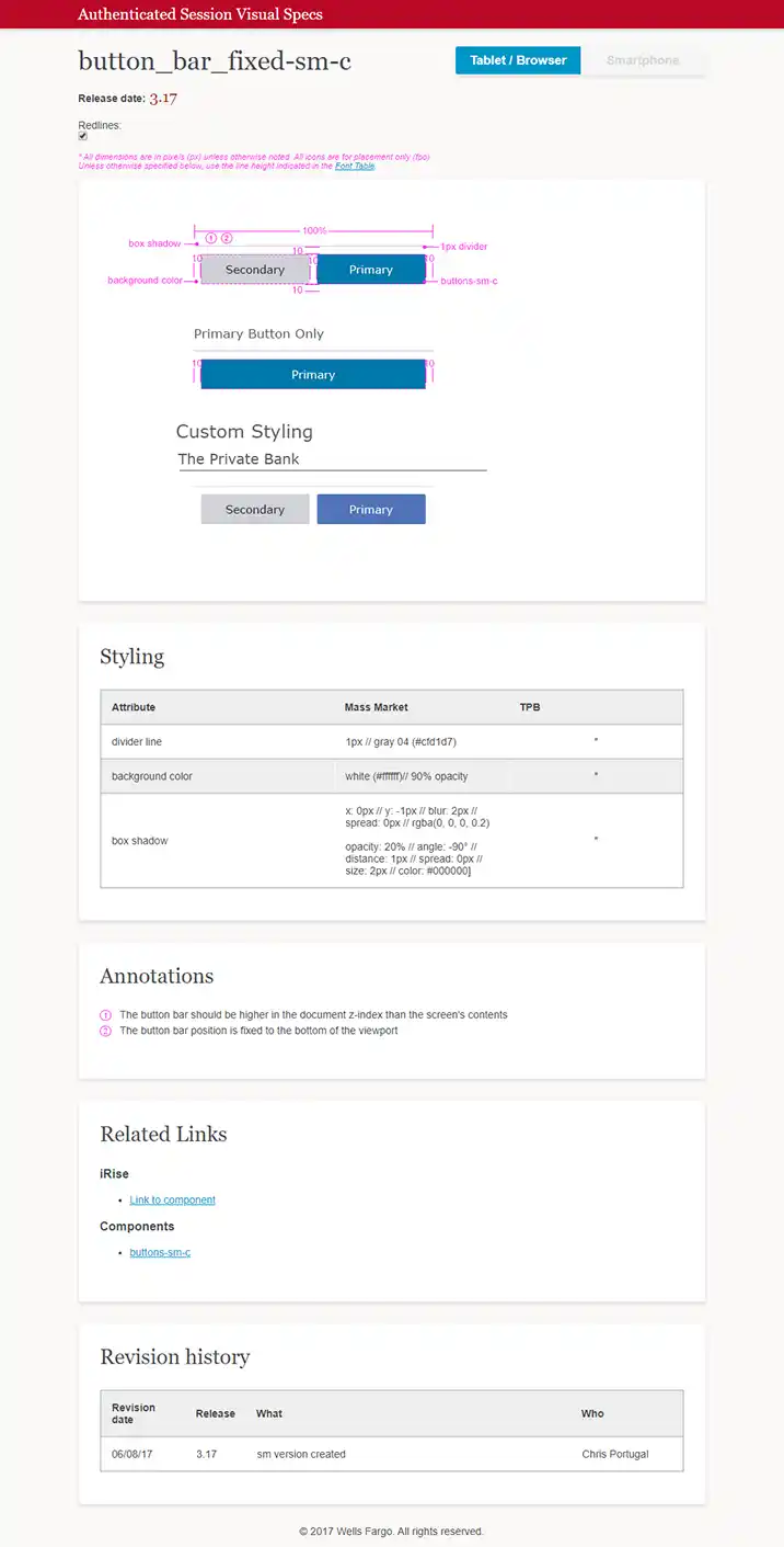
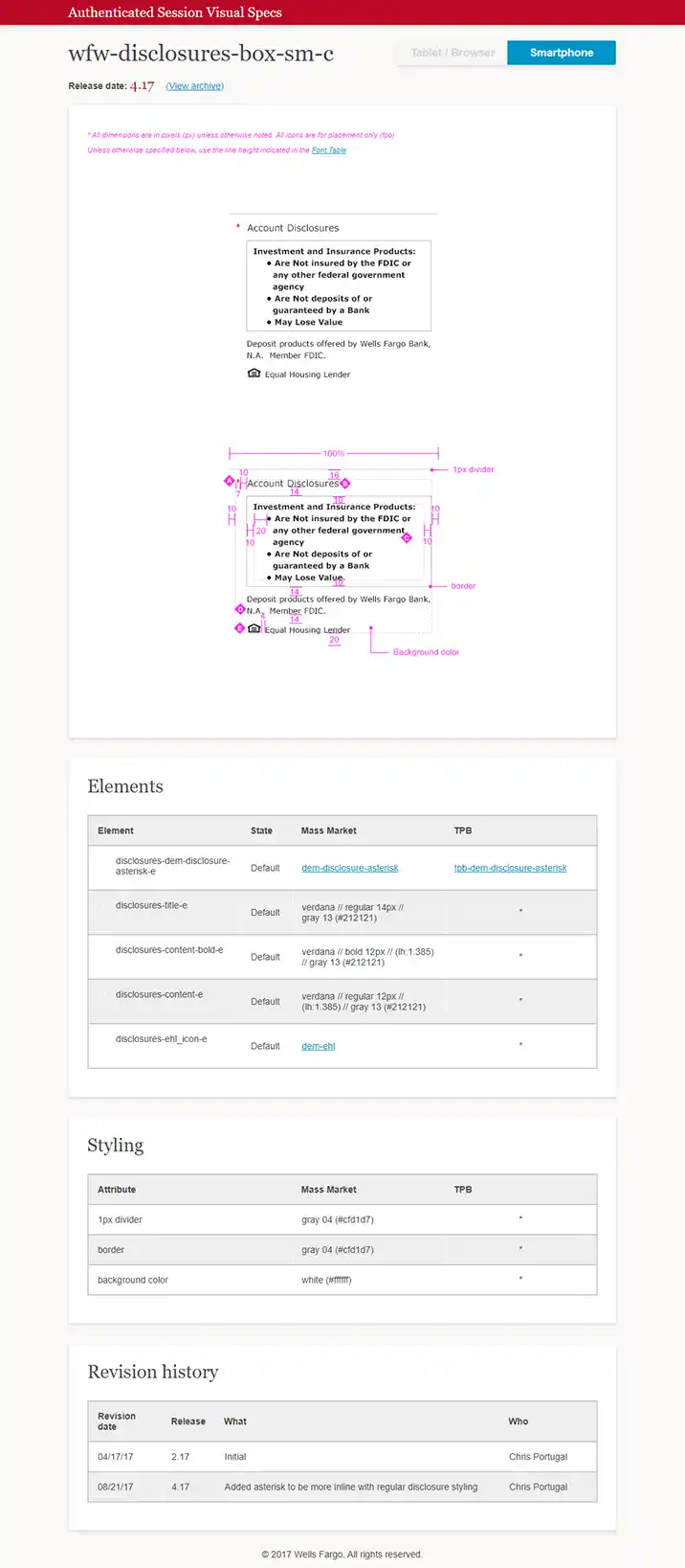
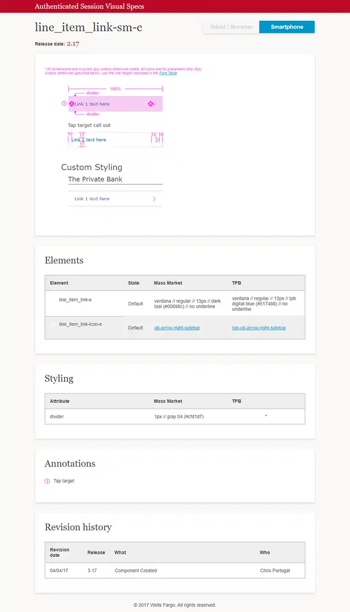
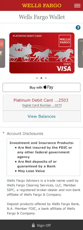
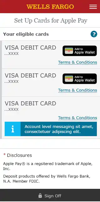
I was responsible for the visual/UI execution for all of Wells Fargo Wallet, including wallet onboarding, card management, and balance views. More critically, I led the design and documentation of over 20 reusable UI components, many of which were integrated into the Wells Fargo design system.
Examples of Components I Created
Card Carousel : A swipeable component to navigate between cards with contextual states (available, disabled, error).
Balance Toggle: Privacy-first “show/hide” toggle, designed for tap-friendliness, screen reader support, and accessibility states.
Card Management Tiles : Expandable tiles for provisioning, removing, and managing cards—with linked accounts and dynamic messaging.
Spinner Overlay : Custom loading state layer that maintained continuity across asynchronous actions.
Wallet Offer + Message Tiles: Used for promotional content and system alerts.
Button Bars + Modal Tours: Fixed-position bars and first-time user modals, designed for onboarding and CTA hierarchy.
Disclosure Modules : Custom legal copy components adapted to WCAG, responsive behavior, and brand needs.
Link Lists + Tile Variants: Extensible components for secondary navigation, account tiles, and state-aware links.
Each component was fully documented with pixel-accurate specs.

Component Examples


Card and Token Management Components
Wallet
To bring the component work to life, here are select screens for Wells Fargo Wallet (iOS and Android) and Card & Token Management (Desktop and Mobile Web):
Card and Token Management

Wells Fargo Wallet & Provisioning


Accessibility was foundational—not a layer added later:
WCAG 2.0 AA+ compliance (contrast, keyboard focus, semantic markup)
Responsive adaptations across 600–799px, 800px+, and mobile-specific specs
States for disabled, error, and loading modes tested across platforms
Working with three different development teams, I had to anticipate platform-specific constraints (Android WebView quirks, iOS touch zones, desktop parity) and design resilient, modular solutions that translated well across technologies.
20+ custom components integrated into the Wells Fargo design system, reused across authenticated mobile banking flows
Cross-platform rollout of the Wallet experience with consistent UI across iOS, Android, mobile web, and desktop
Improved accessibility and spec clarity, reducing QA cycles and accelerating implementation
Helped establish a component-first approach to future digital products within the org
This project was a real lesson in systems thinking. It wasn’t just about designing for one screen—it was about designing for frameworks, engineering handoff, and future-proof reuse. Making it all work at scale meant balancing visual polish, accessibility, and platform constraints to create something consistent and inclusive for millions of users every month.